


$391.00 – Sold Out
| /
Limit 1 per customer/household of each edition type
Fifty years after its original publication, Catch-22 remains a cornerstone of American literature and one of the funniest—and most celebrated—books of all time. In recent years it has been named to “best novels” lists by Time, Newsweek, the Modern Library, and the London Observer.
Set in Italy during World War II, this is the story of the incomparable, malingering bombardier, Yossarian, a hero who is furious because thousands of people he has never met are trying to kill him. But his real problem is not the enemy—it is his own army, which keeps increasing the number of missions the men must fly to complete their service. Yet if Yossarian makes any attempt to excuse himself from the perilous missions he’s assigned, he’ll be in violation of Catch-22, a hilariously sinister bureaucratic rule: a man is considered insane if he willingly continues to fly dangerous combat missions, but if he makes a formal request to be removed from duty, he is proven sane and therefore ineligible to be relieved.


Edition Information
- Limited to 400 copies.
- Signed by Marko Matijašević (creative concept), Damir Mazinjanin (illustrations) and Tvrtko Jakovina (introduction).
- Cased in a slipcase bound in a premium red paper with white foil blocked on the front and on the back of the case.
- Screen-printed cover and spine on premium blue book cloth.
- Tessellation-inspired endpapers printed white on red paper.
- Printed letterpress.
- 22 full page letterpress illustrations.
- Royal UK trim size of 156 x 234 mm (6.14" x 9.21")
- Several hidden design details.
- Bookmark in shape of a plum tomato on one side and bomb on the other side.

Concept and Design
The Essential Edition of Catch-22 is limited to 400 copies.
All three editions share the same creative concept, just interpreted in different ways. The concept stems from the absurdity of war, which Heller so aptly mocked in this cult classic. The goal was to emphasise that absurdity through illustrations and other design elements, thus enhancing the story. Therefore, there are twenty-two illustrations throughout the book, each depicting moments where Catch-22 situations were most prominent in the dialogue between the characters. All these illustrations feature at least one detail where the geometry and logic are broken, akin to the drawings of M.C. Escher, and even the typography used in title—Macula—defies geometry in a similar manner. These challenging illustrations were meticulously made by Damir Mazinjanin.
The introduction for this book was written by a Croatian historian Tvrtko Jakovina, giving an insight into circumstances which led to Korean war, which was what Catch-22 was really about. Not only does he aptly paint the picture of the events that led to the war and how it was perceived in the States, but he also draws parallels with situation in former Yugoslavia, thus providing a very unique and interesting perspective to the themes of the book.
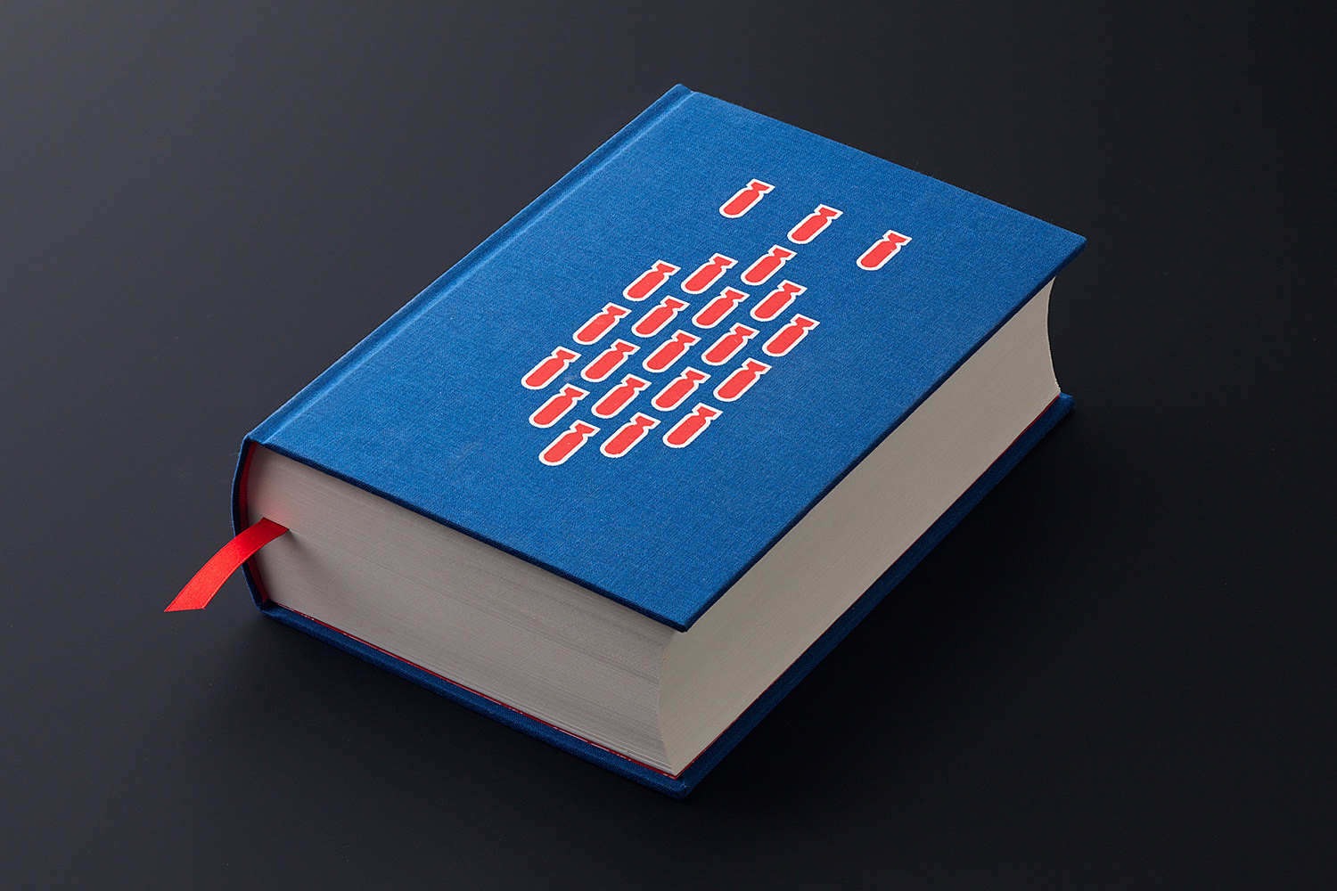
The book comes in a vivid red slipcase, while the front cover of the book features a design of twenty-two bombs in a neat bombing pattern (which Colonel Carthart loved so much). The endpapers inside feature airplanes made in a specific pattern to create a tessellation effect, which is another nod to optical illusions used so prominently in art for this title. The book is completely printed letterpress, including all the twenty-two illustrations.
The bookmark is two-sided, featuring a bomb on one side and a plum tomato on the other side. Both were quite prominent in the story and it’s meant to represent how for some a war can is a horrible thing, while for the other’s it’s just business as usual.
The whole run will have 400 copies, with a few additional publisher’s copies for the key participants of the project that will never go to sale.
Photography: Danijel Berković & Dino Šertović.


Production and Materials
The slipcase for this edition is bound in vivid red paper, with the title blocked in with foil on both the front cover and the spine of the slipcase.
The book is bound in a luxurious blue book cloth and the design on both the front cover and the spine is screen printed. The endpapers are printed white on red paper. The entirety of the book is printed letterpress on our very own Heidelberg Cylinder.
The bookmark is produced by careful blending of shapes of a bomb and a tomato in order to reach the desired optical illusion.

Product info: PREORDER (ETA: January/February 2024), published by Amaranthine Books
&media=https://darkregions.com/cdn/shop/files/LBE-Catch-2_201c9c18-f205-45e1-aee5-23b8b0e4f1f4_600x.jpg?v=1696263334)